Threat Analysis Center
The Threat Analysis Center dashboard lets you see and analyse detection numbers and trends.
Go to Threat Analysis Center to see the dashboard.
Total cases
This shows the total number of cases manually created by customers on Sophos Central, or cases that are automatically generated from all detection sources.
The default time range is Last 7 days. You can change that to Last 30 days, Last 3 months, Last 6 months, or Last 1 year.
You can use the following sets of filters.
- Severity: Show detections with a specific risk level or levels. For example, Critical, Low risk.
- Status: Shows the status of the case. For example, Action Required, Investigating.
- Case type: Shows the type of case. For example, Active Threat, Customer Request.
- Management type: Shows who manages the case. This can be the customer or Sophos.
- Escalation: Shows whether the case has been escalated.
- Verdict: Shows the clasification of the case. For example, False Positive, True Positive.
For more details, see Cases.
Total cases count
You can customize the Total cases count graph to show a breakdown of the cases. For example, you can show cases broken down according to their severity: Total, Critical, High, Medium, Low risk, or Info.
To do this, go to the drop-down menu above the chart and select the feature you want to see a breakdown for.
The default time range is Last 7 days. You can change that in the drop-down menu to Last 30 days, Last 3 months, Last 6 months, or Last 1 year.
Recent cases
This shows the most recent cases. To see the full list of cases, click the View all icon. ![]()
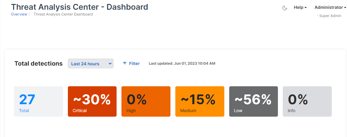
Total detections
This shows the total number of detections and a breakdown of the percentage for each severity level.
Click any figure to open the Detections page pre-filtered to show the severity level you want. The page opens in a new tab.
You can also use filters as described in Set filters.
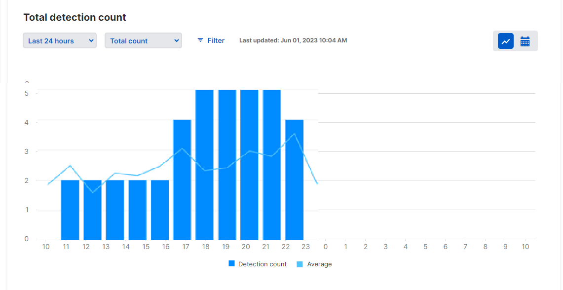
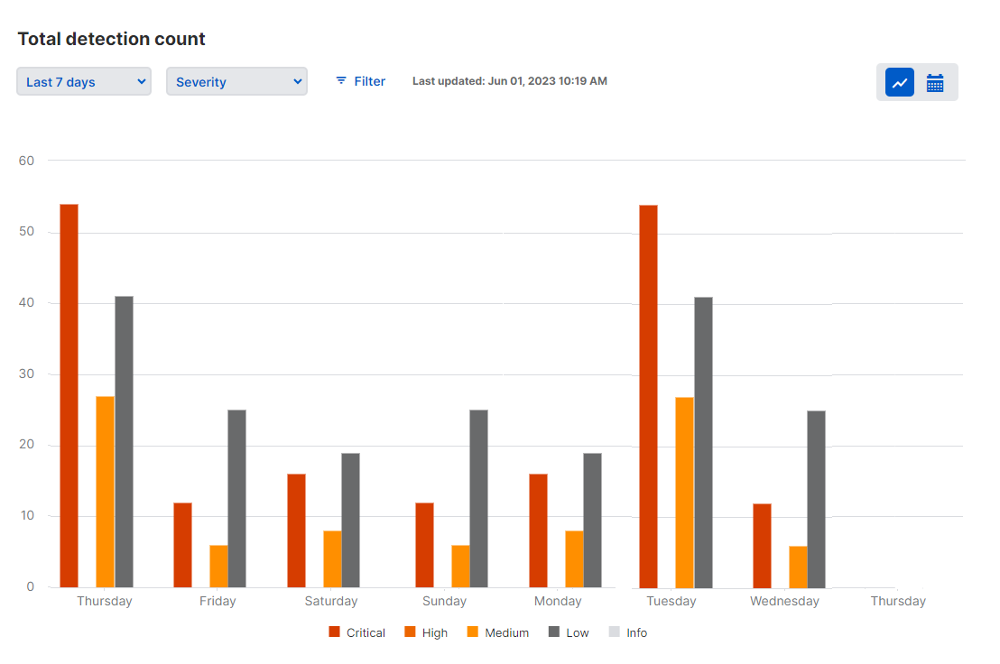
Total detection count
This shows the number of detections during the time range you select, and the trend based on the average numbers in each hour or day.
The trend line is shown only for time ranges up to 7 days.
You can change this graph to show the numbers broken down according to different aspects of the detection. See Show a breakdown of detection numbers.
You can also use filters as described in Set filters.
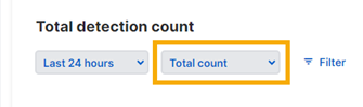
Show a breakdown of detection numbers
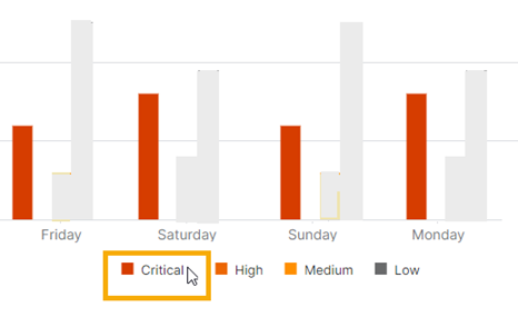
You can customize the Total detection count graph to show a breakdown of the detection numbers. For example, you can show detection numbers broken down according to their severity: Critical, High, Medium, or Low risk.
To do this, go to the drop-down menu above the chart and select the feature you want to see a breakdown for.
When you do this, the bar charts change to show each bar replaced by a group of bars. If you select severity, separate bars show the detection numbers for Critical, High, Medium, or Low risk. Hover on a bar to see the numbers.
Note
The MITRE tactics view uses a line graph. Separate lines show detections for different tactics.
Select graph or heatmap view
You can view the detection numbers as a graph or as a heatmap calendar. The default is graph view. To change it, use the icons in the upper right of the screen. For the heatmap, click the icon on the right.
![]()
Recent detections
This shows the most recent detections on your network.
You can also use filters as described in Set filters.
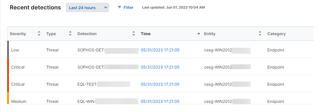
To see the full list of recent detections, click the View all icon. ![]()
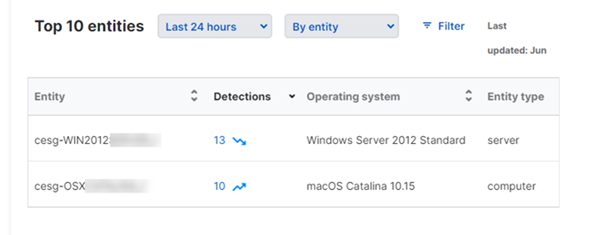
Top 10 entities
This shows the ten entities (for example, servers) with the most detections. Click the number of detections to see a breakdown by risk level.
You can use the drop-down menu above the list to show detection numbers as follows:
- By entity: Shows the devices with the most detections.
- By sensor: Shows the sensors with the most detections. Sensors are products that report detections to the Sophos Data Lake.
You can also use filters as described in Set filters.
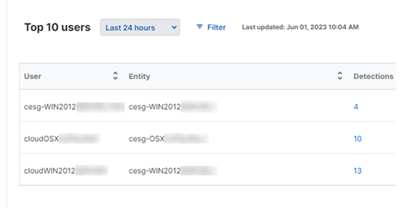
Top 10 users
The ten users with the most detections. Click the number of detections to see a breakdown by risk level.
You can also use filters as described in Set filters.
Recent threat graphs
This shows a list of recently generated threat graphs. Threat graphs are diagrams showing the origins and progress of malware attacks. The full list is available in Threat graphs. See Threat Graphs.
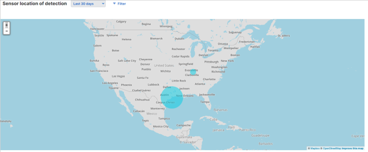
Sensor location of detection
A world map shows the number and breakdown of detections in different geographical regions. You can zoom in to see detection numbers for smaller regions like country, state, or city.
Click the number of detections for a region to see a breakdown by risk level.
You can customize this section as described in Set filters.
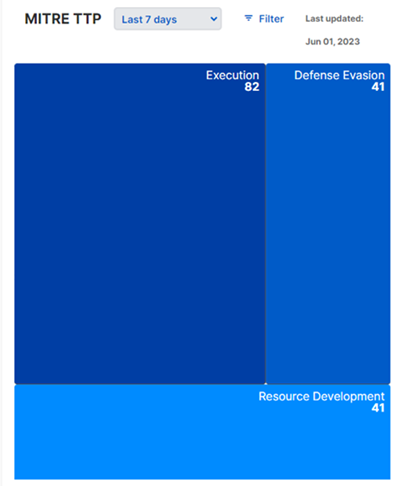
MITRE TTP (Tactics, Techniques, Procedures)
This heatmap shows the number of detections in each MITRE category. Hover over a tactic to see a breakdown by risk level.
Click on a tactic to zoom in to MITRE techniques detected during the time period. Click again to return to the tactics view.
You can customize this section as described in Set filters.
Recent queries
This shows a list of Live Discover queries that you've run or queries scheduled by customers that have run.
Live Discover Endpoint queries and manual, non-scheduled Data Lake queries are only shown in the list if they were run in the previous two hours. After two hours, those queries are removed. Other types of queries are listed for seven days.
To see the full list of recent queries, click the View all icon. ![]()
Set the time range
The default time range is the last 24 hours. You can change that to the last hour, last 7 days, or last 30 days.
You can also select Custom and set a custom range.
Set filters
Filters let you select which data you'll see. Click Filter to see the choices.
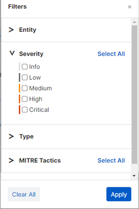
You can use the following sets of filters.
- Entity. Enter the name of a specific device to see detections that occurred there.
- Severity. Choose to show detections with a specific risk level or levels.
- Type. Choose to show detections of a specific threat type.
- Operating system. Choose to show detections that occurred on devices running a specific operating system or systems.
- MITRE Tactics. Choose to show detections that match specific MITRE tactics.
- Detection. Enter a detection name to see instances of that detection.
- Category. Choose to show detections reported by a specific type of sensor. For example, firewall.
You can choose multiple options in each set or click Select All next to a set. You can also choose options in multiple sets.
You can combine filters with a view selected from the drop-down menu (in sections that have one).
Highlight details on a graph
You can highlight specific bars or lines on a graph. Hover on the color swatches shown in the key next to the graph. For example, in a graph showing detections by severity, click the color for a specific risk level to highlight that bar.