CPU usage graphs
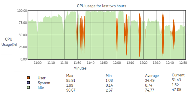
The CPU usage graph shows CPU usage by users and system components.
The x-axis shows minutes, hours, days, or months (depending on the time period selected).
The y-axis shows the percentage of CPU usage for users and system components.
Legend:
- Orange: CPU usage by user
- Purple: CPU usage by system components
- Green: CPU idle time
