Live users graphs
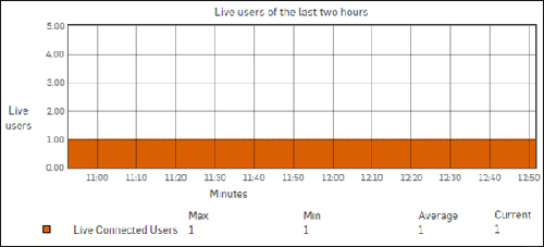
The Live users graph shows the number of live users currently connected to the internet for the selected time period.
In addition, it shows the minimum, maximum and average number of users connected during the selected period.
This helps you determine the peak hour of the day.
The x-axis shows minutes, hours, days, or months (depending on the time period selected).
The y-axis shows the numbers of users.
Legend
- Orange: Number of live connected users
